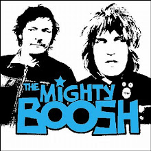
This is my second mock up. This design is simple but is good for catching the attention of the audience. I think this faded image works well and plays a good role of making this magazine looking good. However, i think this magazine is missing a subtitle which i will look at putting on and updating.

No comments:
Post a Comment